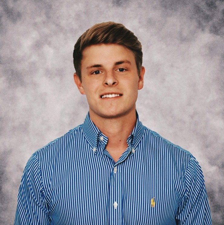
TJ Gulley is a graphic designer who works with our team on a regular basis to create fresh, innovative branding for our clients. We asked him to share a few thoughts on design with our readers.
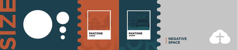
3 design elements every project must consider
TJ Gulley • September 9, 2020
Design plays a crucial role in business, and as a designer, there are a few key things to keep in mind throughout the creative process.
Many people see the final output of graphic design and think, “That looks cool,” without considering the different phases of the project and why the design made them feel something. There are multiple elements that are essential to the process, but I want to go over the three design elements—color, size, and space—that are fundamental to almost every project I work on, and I’ll share how I use them in my daily walk as a designer.
The psychology of color
I love the process of choosing color because it dictates the entire feel of the brand. Color actually affects people on a psychological level—sounds crazy right? Different colors can affect a person’s mood without them even realizing it.
For example, red is an active color known to induce hunger, which is why you see it used in many fast food logos. Blue, on the other hand, is known for its calming effect which portrays reliability and trust. You’ll notice that many hospitals and insurance companies incorporate the color blue into their brand because they want to imply that feeling of trust. So, when you bring this knowledge into your own process, it’s important to first understand the company’s purpose.
Another important thing to consider when choosing color is to make sure that the colors you’re using (if you’re using more than one) are complementary—they work well together. For example, blue and orange are known to work well together, but not every shade of orange will work with every shade of blue, so you have to use your instinct based on the specific brand.
When you use color intentionally and make an effort to understand its effects, it can create a powerful impact for your clients.
Creating a focal point with size
Size has a few different meanings in design. There are a number of techniques you can use with size, but the main goal is to direct the consumer’s eye and help them navigate your design successfully. Like color, it can be used as a tool to control the way a person instinctively reacts when viewing the product.
Of course, there’s room to bend and stretch the rules when it comes to playing with size. Even though people tend to read from left to right, you can adjust the placement of the elements as long as you can manipulate the way it reads.
One way to do this is by increasing the size of the focal point. People naturally focus on the largest element first because it gives the impression of having the most importance. This is why designers tend to make the header on a body of copy the largest, the actual copy second-largest, and the fine print the smallest.
Sizing is also critical because it can bring balance to a design without making everything boring and symmetrical.
However, size isn’t just limited to the hierarchy of text. It can also come into play with the way you lay out your images, or even a logo design. You want to make it as easy as possible for your audience to know where to look first. This is why elements like size are so useful in the design process and they are almost necessary to control the way people navigate and react to the finished product.
Taking advantage of negative space
“I just need some space…”
When you’re working with a lot of copy, a design can get really cluttered really quickly. Space tends to be one of the toughest elements to implement successfully when working with text-heavy pieces.
White space, sometimes referred to as negative space, may be a foreign term to some and might not seem that significant, but it goes a long way in creating an effective design. It’s always important to have some breathing room within your layout, because if there’s too much to read or look at, there’s a good chance that people will become overwhelmed and won’t take the time to digest it all.
But white space doesn’t only refer to copy layout—it can also be handy in logo design. Using the technique of negative space to create more with less within a logo can be appealing to the eye. Similar to size, space can be a great tool for navigation of the design and helping to create hierarchy. When you give a layout enough breathing room, it creates a much more inviting approach for the consumer.
Implementing these elements and understanding why they’re effective will lead to impactful pieces that get their message across in an inviting way to ultimately enhance the brand. Don’t be afraid to stretch the rules and customize them based on the project. The creative process can be fun for both the client and the designer because nothing is set in stone and the possibilities are endless.
We hope you enjoyed hearing TJ’s perspective on design. Stay tuned to see what we’re cooking up next in the kitchen!
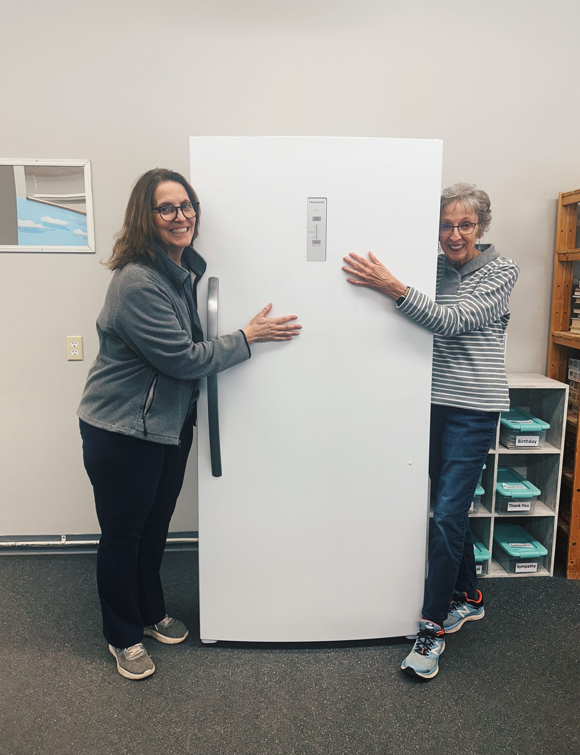
We are excited to announce the recipient of our most recent Food for Thought grant — the Hot Springs Food Pantry, located in Hot Springs, South Dakota. Food for Thought is a fund we created through The Community Foundation to offer grants to organizations that help feed children in our community. This isn’t just about money though. We’re also on the lookout for ways to teach kids about good food, to help them learn to prepare it, and to encourage them to love it as much as we do. We are always looking for organizations in our local communities whose mission aligns with ours and have specific needs we can provide grants for. Because our croux reaches far and wide, “local” doesn’t just mean Tennessee. In this case, the community is local to one of our core team members, Lauren. After moving back to her hometown of Hot Springs, South Dakota to be closer to family, she got involved with the local food pantry and saw a specific need there. The food pantry needed a refrigerator so they could provide more fresh produce and protein to families in the area. They were also seeing an above average need in the community due to rising costs which has depleted some of their funds. The grant received from Food for Thought will go towards these efforts and help provide fresh food for families in the area.
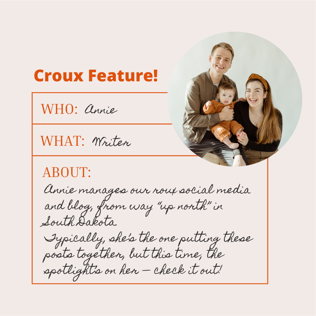
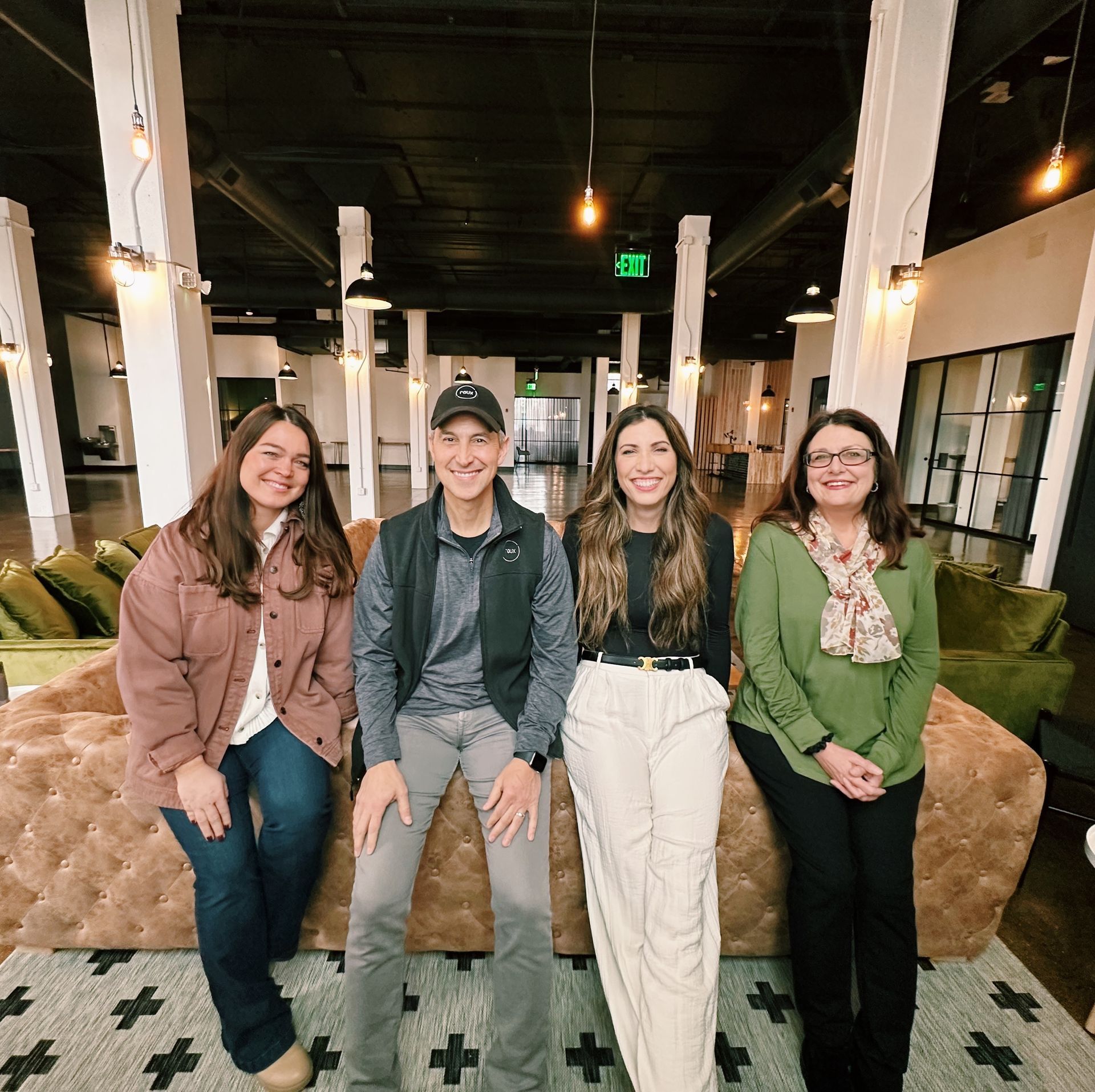
We’re back with another creative croux feature. Normally, these pieces are put together by one of our freelance writers, Annie Van Essen, but this time, we’re spotlighting her!
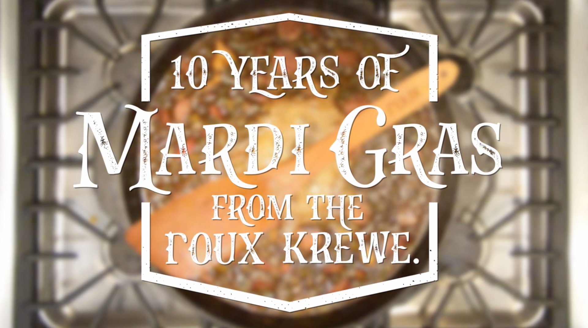
We celebrated our 10-year anniversary in July 2023, making this our tenth Mardi Gras as a krewe. We are so thankful for the many projects, partnerships, clients and friends who have been a part of our journey so far. The essence of Mardi Gras can be summed up in one lighthearted phrase, “ Laissez les bons temps rouler!” — French, for “Let the good times roll!” We’ve had a lot of good times here at roux over the last decade, and we’re excited for them to keep on rollin’. Bon Mardi Gras and merci beaucoup, friends!
Every January we like to gather as a croux and plan for the year ahead. It serves as a holiday celebration and a strategy session. We look forward to it every year. Over the last few years, we’ve also begun incorporating a “word of the year” practice, where we each choose a word that we will focus on throughout the year.
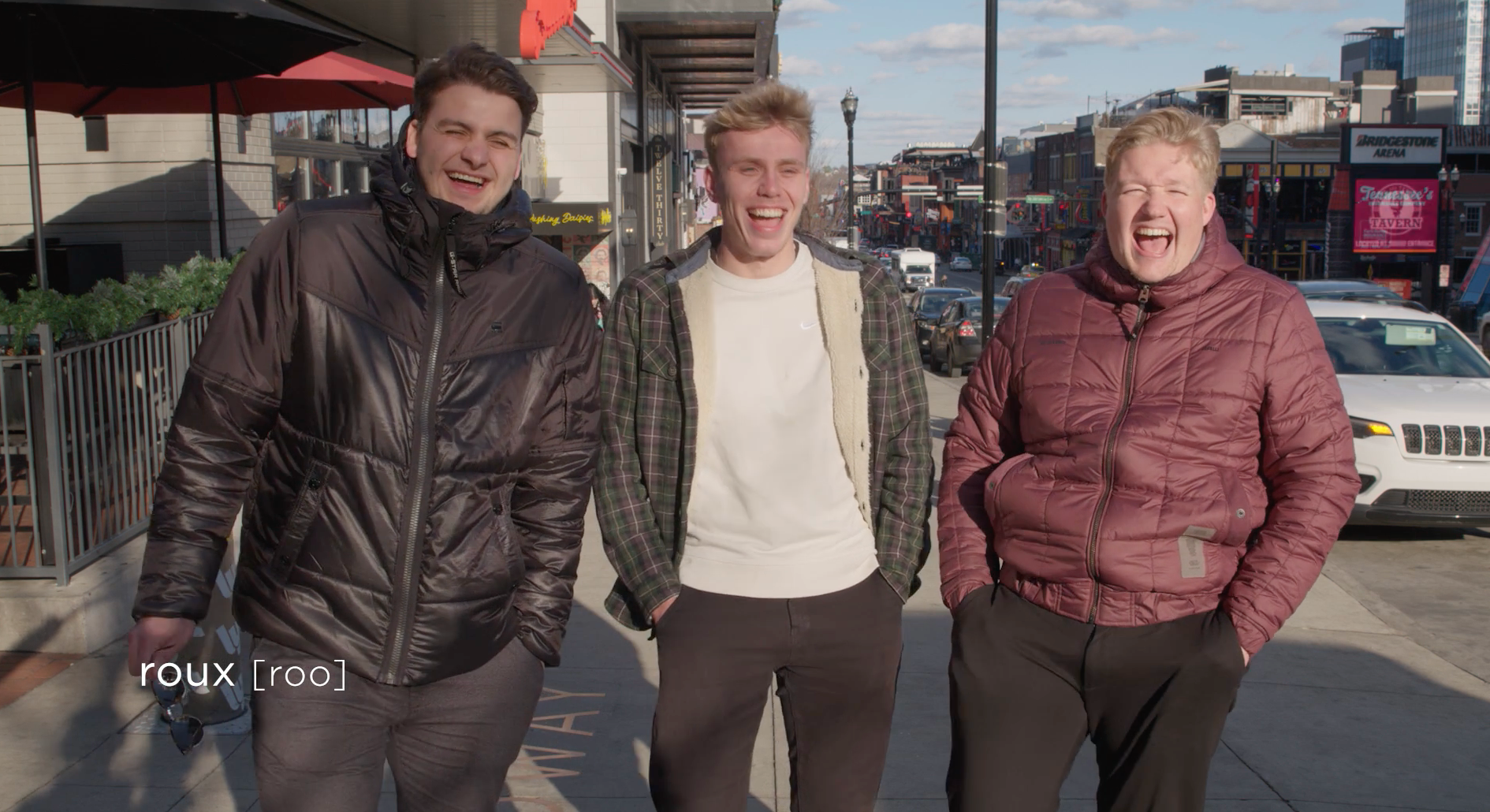
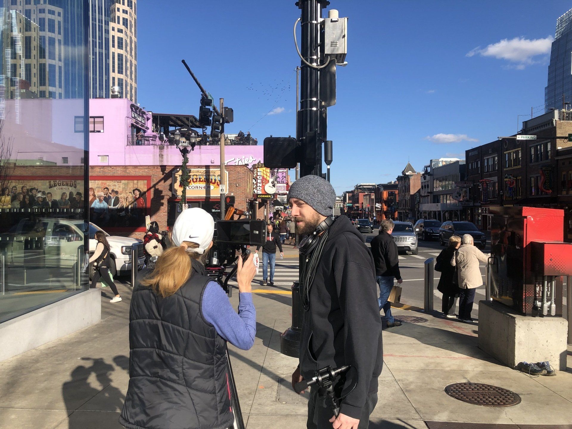
This year, we decided to take our merry-making to the streets of Nashville to see how well the average passerby could interpret some of our favorite Creole vocab. The results were… entertaining. See for yourself!
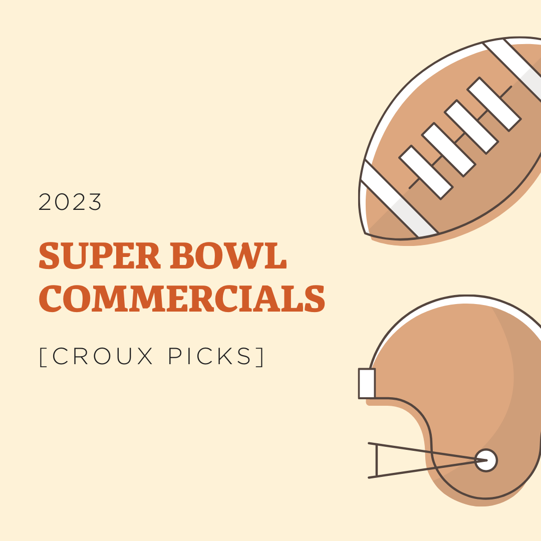
Every year, our croux puts together a roundup of our favorite Super Bowl commercials.
This time around, we thought we’d switch it up and ask for submissions of our team’s favorite commercials EVER. Whether from 2023 or 2003, we want to celebrate the advertising magic of Super Bowl Sunday.
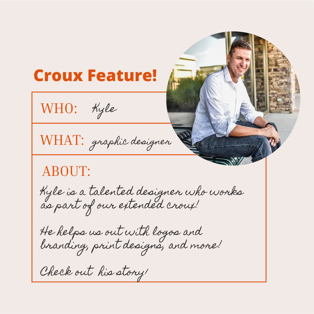
Here at roux, we have a wonderful team of creatives supporting us, including photographers, videographers, writers, and designers.
Today, we’re excited to introduce you to Kyle Sorvick, one of the talented graphic designers we work with as part of our extended croux.
We all look forward to receiving Christmas greetings from friends and loved ones, whether it’s a social media post or a physical card to display in our house or hang on the fridge. But when it comes to company Christmas cards, corporate greetings can sometimes fall a bit flat. We love when a company spices things up and sends a message that’s genuine and fun. Videos can also be a more effective and affordable option for a company, when you consider the reach made possible with email and social media, and the savings on printing and postage. Averitt and JetRight are two local companies that knock it out of the park every year when it comes to their video Christmas cards. Whether they choose to be lighthearted and silly or share a heartwarming message, watching their videos shows you the real people and spirit behind the companies. Check them out below!